Kanaflex Corporation
For more than four years, Trpeski Design has partnered with Kanaflex Corporation to transform how a major industrial hose and pipe manufacturer presents itself to the world. Our most expansive ongoing client collaboration spans a new corporate identity, eight product families, an evolving website with more than 300 product pages, guided product selection, dealer tools, and a connected marketing system. Together, these elements bring the quality and ambition of American-made Kanaflex products into clearer focus across every touchpoint.
- Industry
- Industrial Manufacturing, Hoses and Pipes
- Launch
- 2023, Ongoing Evolution
- Scope
- Brand Strategy · Corporate Logo · Product Family Branding · Brand Guidelines · Photography Direction · Website Design and Development · Product Catalog · Product Search and Filtering · AI Implementation · Dealer Portal Branding and Experience · Sales Materials · Trade Show Design · Marketing Campaigns · Social Media
A manufacturer ready for a new chapter
Kanaflex makes industrial hoses and pipes for demanding applications. Its products have depth, technical specificity, and a clear place in industries where performance matters. But the company’s previous public image did not communicate that strength. An aging identity, limited digital presence, fragmented marketing materials, and a product range that was difficult to explore online created a gap between what Kanaflex made and how the market experienced it.
This was a company-wide opportunity. Kanaflex needed more than a refreshed logo or a better-looking website. It needed a way to explain its expertise, organize a broad product portfolio, give distributors stronger tools, and show up with the same confidence in a search result, a sales meeting, and on a trade show floor.
The partnership has expanded from brand foundations into the full expression of the business. Working with the Kanaflex leadership and marketing teams, we continue to evolve the system for new products, campaigns, and ways for customers to engage.
A strategy built around the whole company
We started by examining how Kanaflex needed to be understood by the people who buy, specify, sell, and distribute its products. The answer had to respect the company’s manufacturing heritage while making its current capabilities and future direction visible.
The brand strategy became the organizing principle for everything that followed: a clearer corporate story, a consistent visual language, a structure for product families, and an experience that helps visitors move from an application or technical requirement toward a relevant solution. The goal was to make a complex manufacturer easier to recognize and easier to navigate without reducing the depth of its offering.
That thinking informed the logo, website architecture, product content, photography, campaigns, and sales tools. Instead of creating isolated assets, we developed a shared foundation that lets each channel do its job while still feeling unmistakably Kanaflex.
One corporate identity, eight hose families
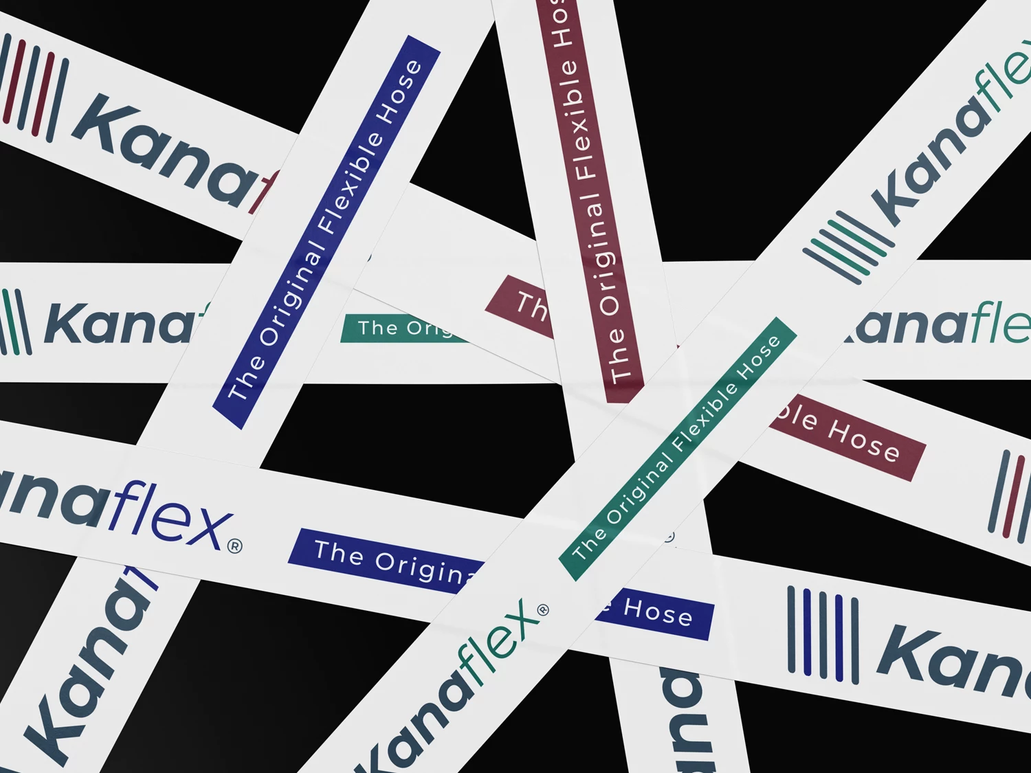
The corporate identity needed to look at home on a digital screen, a technical document, a product label, and a large-scale exhibition display. We developed a new Kanaflex logo and a flexible system for its use, giving the company a contemporary mark that could anchor every application. The identity guide defines stacked and horizontal configurations, a standalone symbol, color variations, and rules for scale, clear space, and co-branding.
The same logic extended into the hose portfolio. We established a related sub-brand structure for eight product families: flexDUCT™, flexFLO™, flexVAC™, flexFORCE™, flexFOOD™, flexVAPOR™, flexFUEL™, and flexCHEM™. Each name creates a more immediate point of entry into a category, while the shared naming and visual principles keep the range connected to the parent brand.
This architecture does more than organize a menu. It gives the sales team a clearer language for explaining the range, helps customers distinguish applications, and creates an expandable framework for future product communications. The system can work at the scale of a single product sheet or across the entire catalog.
An industrial visual language with room to grow
The identity is built from color, typography, layout, iconography, imagery, and the space between them. We developed these elements as a working system so Kanaflex could communicate with both technical clarity and visual confidence. Three ideas sit at its center: flexible, innovative, original.
Montserrat gives the brand a disciplined typographic hierarchy: Medium Italic makes a confident statement in headlines, while Regular and Medium keep longer technical content legible. The core palette pairs Flex Normandy, a structured blue gray, with Industrial Currant, a deep red accent, and Stealth Black for contrast and authority. A custom iconography family and flexible layouts bring order to everything from long product pages to fast-moving social content. Graphic textures built from the geometry of the corporate mark create another recognizable thread through the system.
Photography was equally important. We art directed a complementary approach to micro and macro imagery: close views reveal material, texture, and engineering detail, while broader images show manufacturing environments and the people behind the products. The guide’s photographic direction favors crisp, purposeful images of real work and real materials. The result is a visual story grounded in what Kanaflex actually makes.
We documented the system in detailed brand guidelines. The identity volume sets out the core values alongside practical rules for the mark, product sub-brands, color, type, graphic textures, and photography. It gives internal teams and partners a common reference, making consistency possible as the company continues to grow.
A digital platform that grows with the business
For a manufacturer with a deep technical portfolio, the website has to do more than introduce the company. It must help people find the right category, understand what a product does, examine its specifications, and take the next step with confidence.
We launched the Kanaflex website approximately three years ago and have continued to develop it year after year. What began as a clearer digital home has grown into a more sophisticated, automated, and technology-forward platform with more than 300 product pages. It connects brand storytelling with the detail expected from an industrial catalog. Its information architecture makes the hose families, pipes, accessories, industries, and resources easier to explore. Product content lives inside a consistent page system instead of appearing as disconnected files or isolated descriptions.
The visual design balances a stronger corporate presence with practical utility. Clear headings, structured information, application-led navigation, and purposeful calls to action help visitors move between browsing and inquiry. Resources and educational content give customers and distributors additional context beyond the product list.
The site has become a scalable platform for the marketing team. Each year, we extend its product information, discovery tools, automation, campaign content, and supporting materials within a common structure. This continuing development keeps the experience current as the Kanaflex portfolio and customer expectations evolve.
flexSELECT™ and a better path to the right hose
A large catalog can be powerful and difficult to navigate at the same time. We helped introduce flexSELECT™, a guided product selection experience that starts with a practical question: What are you trying to do? Visitors choose an application, then explore and compare recommended Kanaflex hoses.
Alongside this application-first route, the product finder supports a more technical search. Visitors can narrow products using criteria such as industry, internal diameter, working pressure, weight, vacuum rating, bend radius, and temperature. Together, these paths serve different kinds of users: the person who knows the application but not the product name, and the person who arrives with a detailed specification.
By turning product discovery into a clearer decision process, the website helps people reach relevant options faster and gives the sales conversation a more useful starting point. flexSELECT™ is an example of the larger design goal: make the technical depth of the Kanaflex portfolio accessible without making it feel simple in the wrong way.
AI and the systems behind a growing digital presence
As the website and content ecosystem grew, we brought AI into both customer-facing experiences and the team’s production workflow. The intent was practical: help people navigate a large amount of technical information and help the team create, organize, and maintain content at the scale the new platform requires.
AI formed part of a broader system rather than a standalone campaign claim. It complemented the site’s structured product information, the guided discovery experience, and the human review needed for accurate technical communication. This combination allowed the digital platform to support a much larger product range while giving Kanaflex a foundation for continued iteration.
flexED™ and a brand built to teach
Product information answers what a hose can do. Education helps people understand how to choose, install, maintain, and use it well. We extended the corporate system into flexED™, a distinct educational brand for customers, distributors, and end users.
The identity guide defines flexED™ as a home for practical, engineering-based material: articles, guides, videos, technical graphics, and training. Its purpose is to help people make better selection and safety decisions, extend service life, and avoid costly mistakes. On the public website, this educational direction appears through the Insights and knowledge content alongside the catalog.
flexED™ demonstrates the range of the larger system. The brand can support product discovery, partner relationships, and useful technical education without asking every message to sound like a sales pitch.
flexREWARDS™ and the distributor relationship
The transformation also needed to serve the partners who bring Kanaflex products to customers. We extended the identity into flexREWARDS™, a secure co-op portal for authorized distributors. The experience brings a practical part of the dealer relationship online: partners can submit marketing pre-approval and reimbursement requests, download templates and Kanaflex assets, and seek help with their co-op accounts and materials.
Its visual language grows from the corporate brand while giving the program a distinct purpose. The relationship is deliberate: dealers should recognize Kanaflex immediately, while flexREWARDS™ feels like a dedicated experience built for them. A separate access-key entry makes the authorized partner audience clear at the first interaction.
This partner-facing work shows how the identity can expand without losing coherence. The same system supports a public product catalog, a focused rewards program, and the materials distributors use to represent Kanaflex in the market.
One recognizable brand across every touchpoint
The website is the center of the experience, but the brand lives wherever people encounter Kanaflex. We carried the new visual language into product sales materials, presentations, campaign creative, trade show assets, social media systems, and ongoing content. The identity also appears in the everyday details of the business: brochures and technical layouts, forms, business cards, and branded objects that make the system tangible.
At a trade show, the identity needs to communicate at a distance and invite a closer conversation. In a product sheet, it needs to organize technical details precisely. In a campaign, it needs to make a clear point quickly. On social media, it needs to remain recognizable across changing formats and topics. Each application has a different job, but all of them draw from the same brand foundation.
Content, messaging, design, and photography work together to present Kanaflex as the company its products already suggest: knowledgeable, capable, and ready for what comes next. Ongoing creative partnership means the system can adapt to launches and new priorities while keeping the company’s public image connected.
The result
Kanaflex now has far more than a new look. It has a corporate identity, a named product family, a substantial digital catalog, guided product discovery, a dealer-facing brand extension, and a set of tools for communicating consistently across physical and digital channels. The website is an active part of that system, growing more capable through successive rounds of design, content, and technology work.
The work has expanded the company’s digital footprint and created more opportunities for visitors to discover products and express interest. During the multi-year partnership, Kanaflex has also seen year-over-year revenue growth. The design and marketing platform is one part of that broader company transformation, supporting stronger recognition, clearer sales conversations, and a more coherent path from first impression to inquiry.
Most importantly, the brand now presents the depth of Kanaflex manufacturing and product expertise with the clarity it deserves. From the corporate mark to the detail of a product page, every touchpoint contributes to one connected story of American-made industrial products and the people behind them. The ongoing partnership keeps building on that foundation as Kanaflex introduces new products, content, and experiences.